Formula 1, Airbnb and the Power of Logos

It’s not every day that graphic design makes the front page, at least at least not as the topic for discussion.
Uber’s made the news again recently, with yet another new logo—their fourth in recent years. Dunkin’ Donuts just announced that they are dropping “Donuts” from their well-known logo. Even the Ad Council replaced its iconic logo; it’s the organization’s first significant branding update in 75 years.
But there are two reworked logos that continue to generate buzz, well after their introductions: those of Formula 1 and Airbnb.
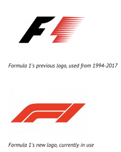
Formula 1, or F1, is the highest level of single-seat auto racing, and one of the most popular spectator sports on the planet. If you were to think “race car,” it’s a Formula 1 car that you’d most likely picture. F1 enjoys huge success in much of the world and has a particularly passionate following amongst its fans. And, when F1 decided to rebrand after twenty-three years, F1 fans got angry.
The release of the new F1 logo coincided with the departure of long-time (and controversial) chief executive Bernie Ecclestone, and was intended to usher in a new era for the brand. The logo was also introduced to render better across new media platforms than what F1 had been using. Specifically, the feathered red “motion” element of the previous F1 logo didn’t translate well when displayed digitally.
But the new logo wasn’t the old one that F1 fans had grown to love. Some of the criticisms of the new F1 logo are that it is “simple,” “amateurish,” “derivative,” and “lacks energy.” That it doesn’t “scream F1.” The logo’s creators have defended their work by saying that it projects a sense of “speed, attack, and control,” and that it “locks up” well with both the F1’s new custom typeface and its partner logos. The design community generally defended the new logo, although it recognized that the modernization came at the expense of some brand equity.
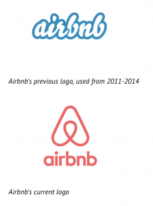
And, though its fans might lack the fervor of those of F1, Airbnb—the hugely popular online lodging marketplace, is a brand force as well. When its new logo was released, it received many of the same criticisms that F1’s did. That it’s “derivative, “boring,” and “basic.” Some claimed that it was copied from a book of logos published in 1988. Others pointed out that it appeared to be a dead ringer of an existing logo of a company called Automation Anywhere (that company’s since changed their mark). The new Airbnb logo quickly became the talk of online forums like Reddit, too, but for an entirely different reason. As one commenter put it, “[the new Airbnb logo] manages to abstract all of the private parts into one.”
But, original or not (and unlike with F1’s new logo), the popular consensus seems to be that Airbnb’s new logo is a huge improvement over the old, and more befitting of the company’s newfound stature. The graffiti-ish mark that Airbnb had used previously was reportedly created on a napkin in a matter of minutes by one of the company founders, and was never really seen by most as a serious attempt at branding.
So, what’s next, then, for these designs and for the companies they represent?
[inlinetweet prefix=”@sparkingbrands” tweeter=”” suffix=””]Graphic design in popular culture and in the mainstream press is something to be celebrated.[/inlinetweet]
As of this writing, F1 is locked in a trademark battle with the 3M Corporation, the Minnesota manufacturer of Scotch tape and Post-it notes, who argues that the new F1 logo is too similar to that of its Futuro brand of “compression legwear products.” F1, however, continues to thrive under its new leadership and reportedly has no plans to change their logo.
Airbnb is still the darling of its industry, despite weathering regular controversy, and continues to be hugely successful; it saw record revenues of close to $2.6 billion dollars last year, from a staff of only 3100 employees.
Both F1 and Airbnb will almost certainly continue to find success for the foreseeable future, controversial logos or not. As will Uber, the Ad Council, and Dunkin (Donuts). One could argue that any publicity is good publicity, and that all the buzz surrounding their new logos has only helped the companies’ bottom lines. I’d argue that any discussion of graphic design in popular culture and in the mainstream press is something to be celebrated, particularly discussion as spirited as this: it proves the power of logos.